Crux Website:
Product page
Timeline:
Jul 2022
sector:
Business Intelligence, Visual Design, Web Design
Team:
Design team: Avi Agarwaal, Sanjana Mohan
Content Writing: Tami Kelly
Development: External team – Devesh
My role:
End-to-end project delivery, Visual Design, Design for Web and Responsive, Facilitating and managing with dev and content team.

www.cruxintelligence.com
Crux Website:
Product page
Timeline:
Jul 2022
sector:
Business Intelligence, Visual Design, Web Design
Team:
Design team: Avi Agarwaal, Sanjana Mohan
Content Writing: Tami Kelly
Development: External team – Devesh
My role:
End-to-end project delivery, Visual Design, Design for Web and Responsive, Facilitating and managing with dev and content team.
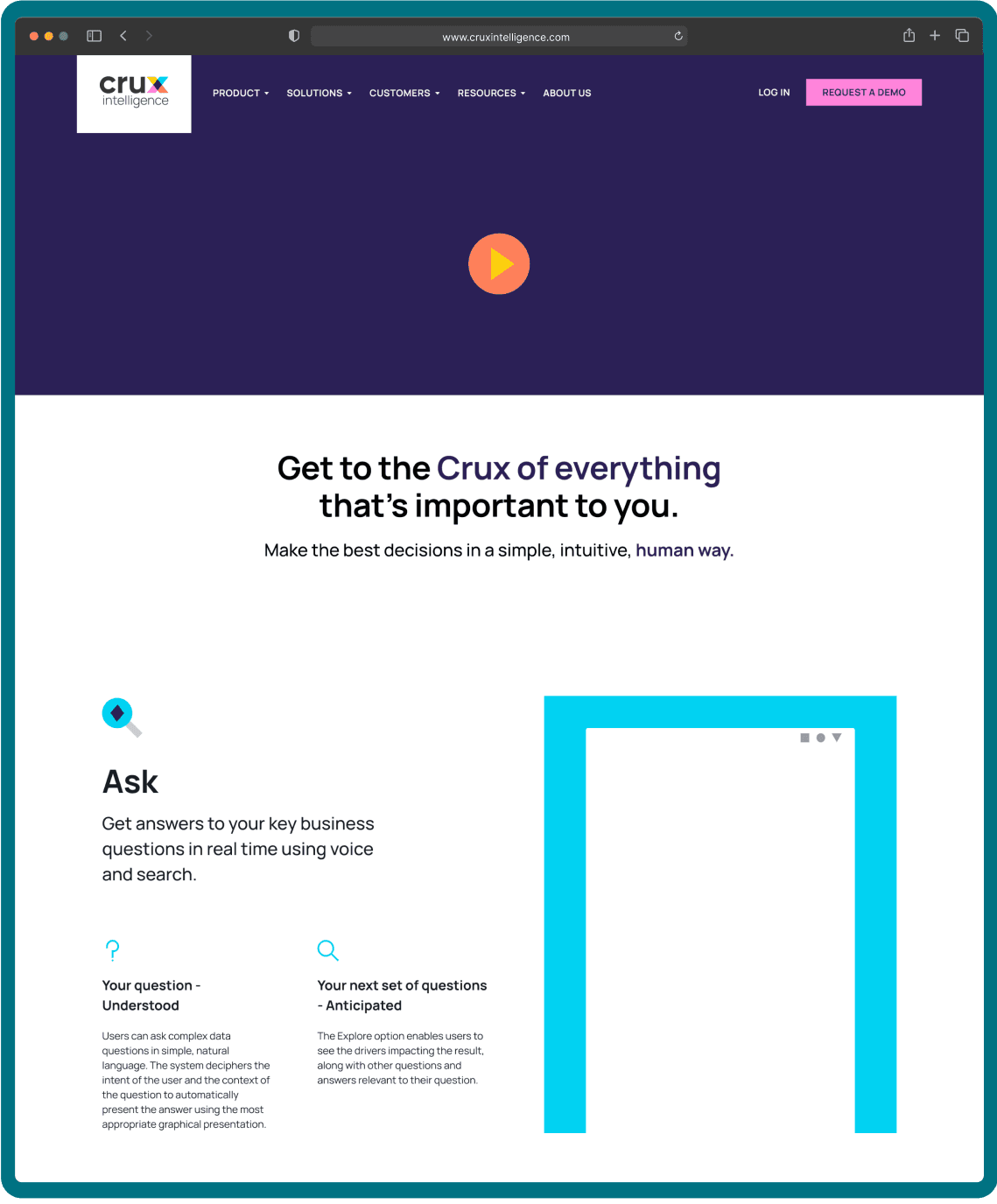
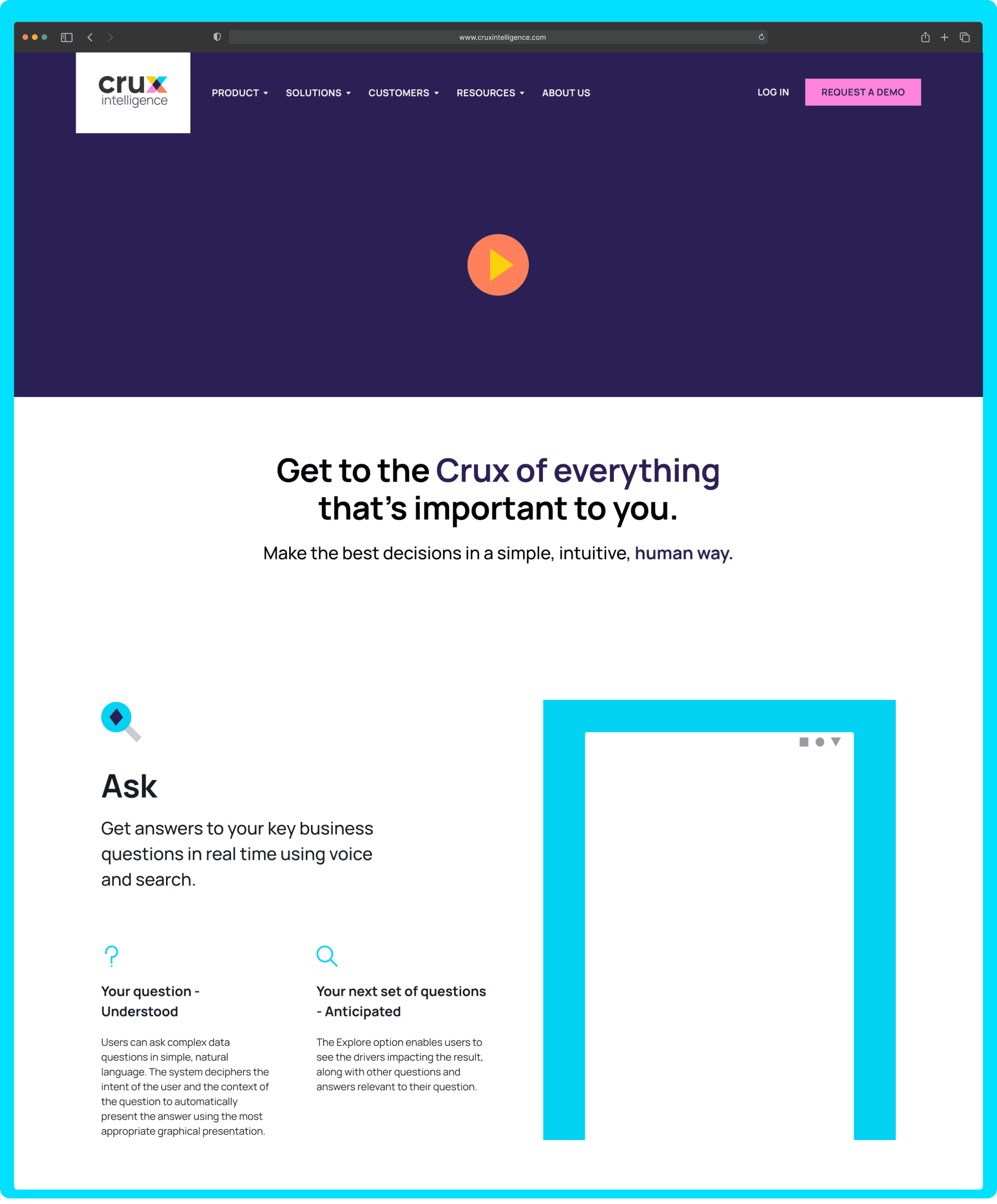
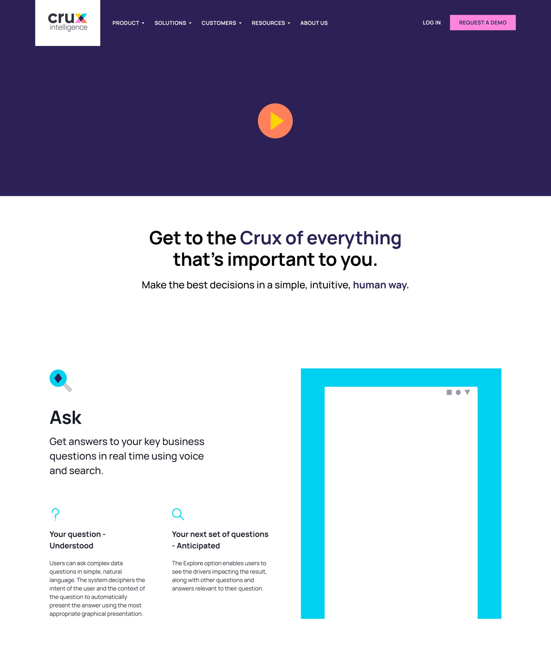
The product page of Crux Intelligence was introduced to give users context on what the key features of the app are. The goal was also to make the structure of the website simple enough to accommodate scalability. It had to be made in such way that if there was a new feature introduced, all one would have to do is duplicate and add content to that section.
Check the whole process I followed to design the page here.
The content is laid out in a way where the information is bite size and easy to cosume.

www.cruxintelligence.com
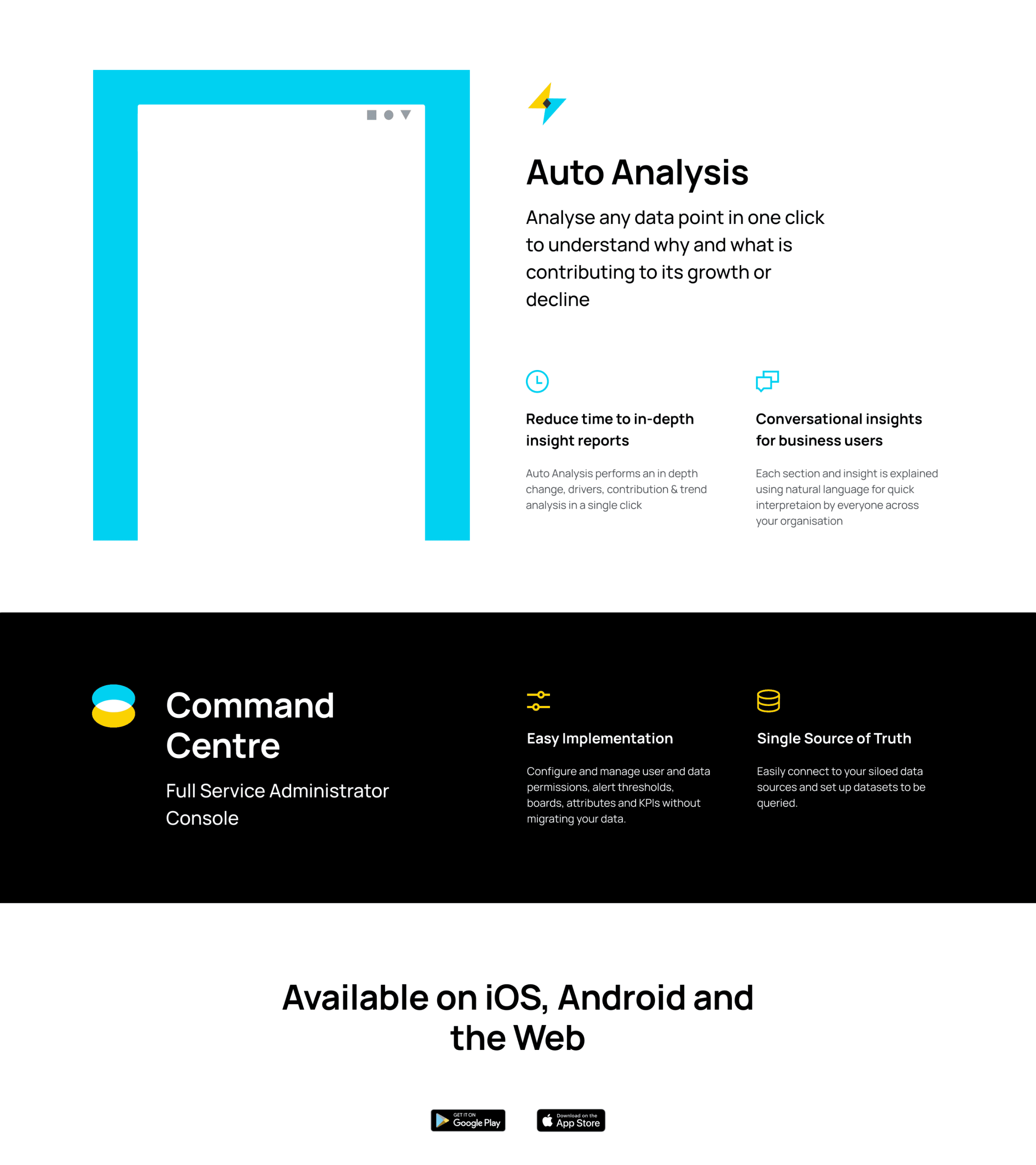
All the sections are completely customizable and scalable.
An important learning from my practice is that the final and fully developed website’s accuracy of development is equally proportional to how well you have done the hand-off as a designer. As critical as it is to design it also equally necessary to keep your designs extremely structured for easing the process out for the development team.

Learnings
One way to go about the content is by grouping paragraphs together that would follow a very similar visual pattern and/or use a comparable visual style.
Do not constrain your references to be derived from other products within the same industry you’re trying to build.
One thing I absolutely loved about my team is the level of importance we gave to getting feedback on everyone’s work and also the attitude towards criticism.
Export your assets for easy handoff.
Using auto layout and components helps! Big time!
The product page of Crux Intelligence was introduced to give users context on what the key features of the app are. The goal was also to make the structure of the website simple enough to accommodate scalability. It had to be made in such way that if there was a new feature introduced, all one would have to do is duplicate and add content to that section.
Check the whole process I followed to design the page here.
The content is laid out in a way where the information is bite size and easy to cosume.


www.cruxintelligence.com

All the sections are completely customizable and scalable.
An important learning from my practice is that the final and fully developed website’s accuracy of development is equally proportional to how well you have done the hand-off as a designer. As critical as it is to design it also equally necessary to keep your designs extremely structured for easing the process out for the development team.

Learnings
One way to go about the content is by grouping paragraphs together that would follow a very similar visual pattern and/or use a comparable visual style.
Do not constrain your references to be derived from other products within the same industry you’re trying to build.
One thing I absolutely loved about my team is the level of importance we gave to getting feedback on everyone’s work and also the attitude towards criticism.
Export your assets for easy handoff.
Using auto layout and components helps! Big time!
The product page of Crux Intelligence was introduced to give users context on what the key features of the app are. The goal was also to make the structure of the website simple enough to accommodate scalability. It had to be made in such way that if there was a new feature introduced, all one would have to do is duplicate and add content to that section.
Check the whole process I followed to design the page here.
The content is laid out in a way where the information is bite size and easy to cosume.


www.cruxintelligence.com

All the sections are completely customizable and scalable.
An important learning from my practice is that the final and fully developed website’s accuracy of development is equally proportional to how well you have done the hand-off as a designer. As critical as it is to design it also equally necessary to keep your designs extremely structured for easing the process out for the development team.

Learnings
One way to go about the content is by grouping paragraphs together that would follow a very similar visual pattern and/or use a comparable visual style.
Do not constrain your references to be derived from other products within the same industry you’re trying to build.
One thing I absolutely loved about my team is the level of importance we gave to getting feedback on everyone’s work and also the attitude towards criticism.
Export your assets for easy handoff.
Using auto layout and components helps! Big time!


